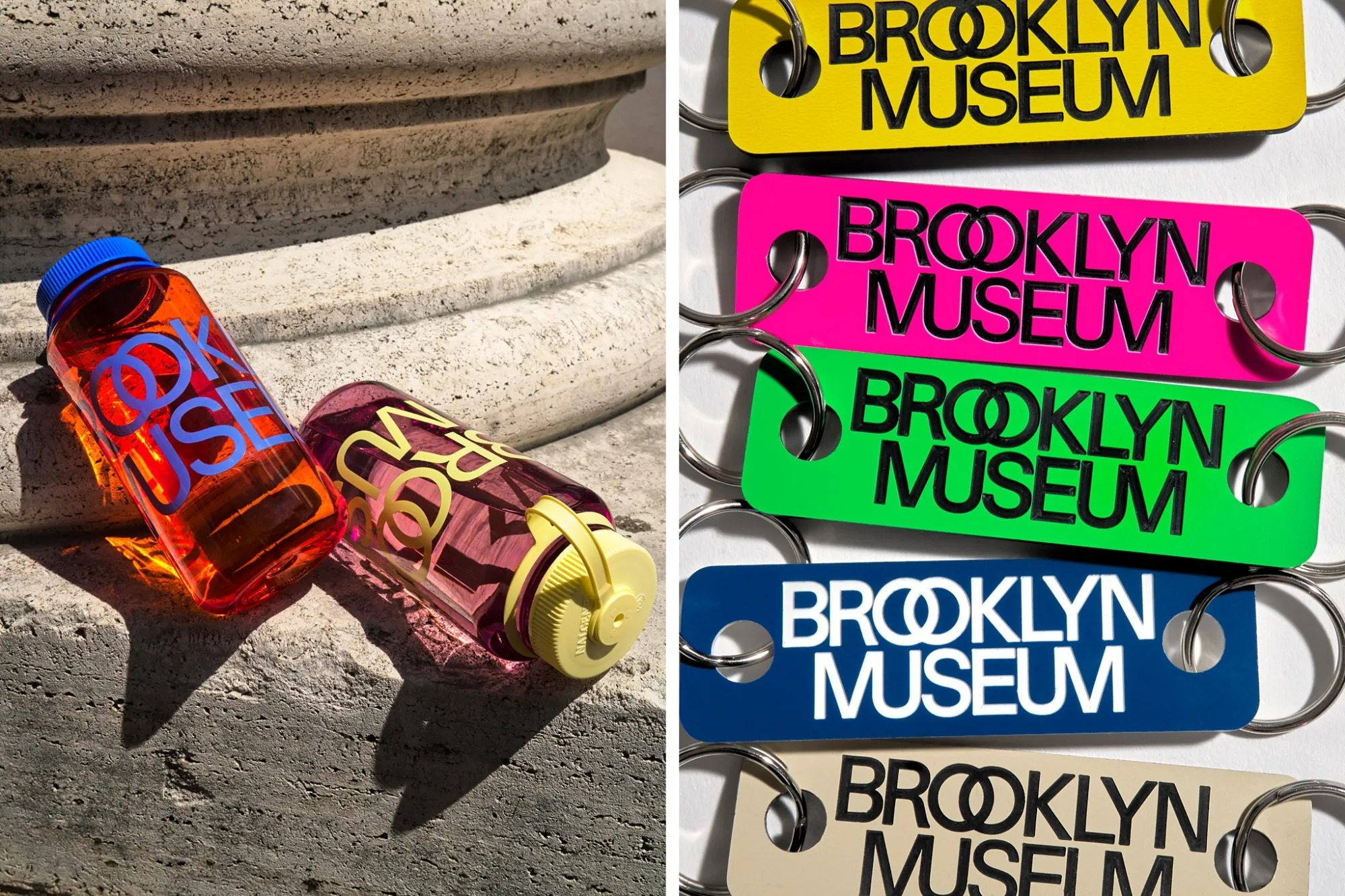
Can a 200-year-old institution rebrand as cutting edge? The Brooklyn Museum is attempting to do just that with its new logo design.
The new “visual identity” of the museum entails a sans serif font, new ligatures featuring an overlapping ‘o’ in Brooklyn and a combined ‘u’ and ‘m’ at the end of museum, and two dots surrounding the institution’s name intended to mimic those that frame the names of ancient philosophers, playwrights, and poets on the building’s facade.
“This reference to writers and thinkers links to our beginnings as a library and to the intersectional nature of the arts,” the museum stated in a release.
“In particular, the brand looks to the Museum’s iconic building, considering its evolution from an original neoclassical design by McKim, Mead & White to its moves toward modernism in the 1930s, to recent projects that have created more open and welcoming spaces. The brand draws on these elements from our past and unites them with our identity today as a contemporary institution,” it continued.
The logo was designed by Brooklyn-based graphic design studio Other Means, with support from the museum’s in-house graphic designers.
But does introducing a new logo in vibrant colors across various forms of signage, digital campaigns and merchandise equate to a brand reset? Perhaps not when the “new” design is eerily reminiscent of the 1972 Massimo Vignelli Bloomingdale’s logo, which also features the signature double ‘o’ ligature. With no critical attention either way thus far, the new redesign hasn’t yet made the splash the museum was seemingly hoping for.
Arguably, the Brooklyn Museum is late to the party. Last year, New York saw its own rebranding of sorts to mixed reviews that left New Yorkers nostalgic for the old logo. Previously, in 2016, the Metropolitan Museum of Art also rebranded to make its ‘m’ look like a Leonardo work. The change was met with criticism that drew comparison to “a red double-decker bus that has stopped short, shoving the passengers into each other’s backs”, much to the institution’s chagrin.
“The ways that audiences are engaging with museums are expanding, and we needed a new brand that meets the demands of the day, honors our rich history, and brings a whole lot of energy. And there’s no better time to launch it than our 200th anniversary,” Brooklyn Museum director Anne Pasternak said in a statement.
To that end, the redesign also begs the question: what sort of future is the Brooklyn Museum pursuing? The museum, according to the release, envisions itself as a kind of cultural hub for “multifaceted audiences”, boasting an “art museum, educational center, forum for ideas, weekend hotspot” of sorts. Over the last few years, the institution has pivoted towards exhibitions that appeal more to a general audience than art world stalwarts, with comedian Hannah Gadsby curating a show on Picasso and countless fashion shows year over year intended to boost overall attendance.
Perhaps, then, borrowing from retailers is just the approach the museum is hoping will attract all through its doors.


